- Down the Rabbit Hole with The Well at the World’s End
by Kathelene McCarty Smith
From time to time, a book stops you in your tracks. The Well at the World’s End did exactly that. The department acquired the book in 2023, but I had not had the opportunity to take a close look at it since then. Of course, the instant I opened its vellum binding, I once again found myself falling down a rabbit hole, which, of course, necessitated learning more about our edition.
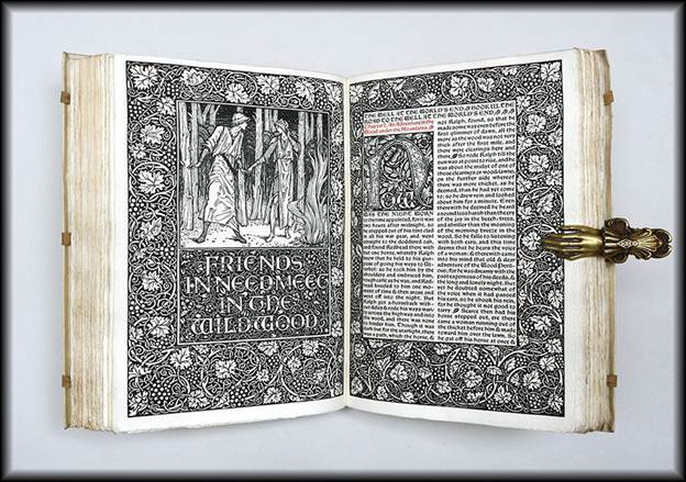
Figure 1: UNCG’s Beautiful Kelmscott Press First Edition of The Well at the World’s End
The Well at the World’s End is a remarkable treasure. Published in 1896, the novel was written by William Morris and printed by the Kelmscott Press. While Morris is frequently remembered first for his impact on interior design, he was a complex and influential presence across the Victorian cultural landscape. Indeed, his interests spanned art, literature, architectural preservation, and social reform.
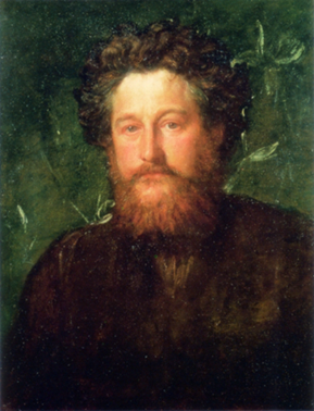
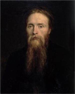
Figure 2: Portrait of William Morris by George Frederic Watts and portrait of Edward Burne-Jones by George Frederick
The book was printed by Morris at the Kelmscott Press in Hammersmith, Middlesex, England, as part of a limited edition of 350 copies on paper. A collaborative effort between Morris and his lifelong friend Edward Burne-Jones, its design harkens back to Medieval book production techniques, mirroring the interest in Medievalism and the Pre-Raphaelite movement of the late 19th century, which the Kelmscott Press embraced. [i]
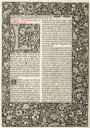
Figure 3: Gothic Lettering and Double Columns Seen in the Novel
Its vellum binding, elaborate lettering, double columns, and wood-engraved images reflect the popularity of the Neo-Gothic style in the Victorian period, and it was the first Kelmscott Press book produced in this format.[ii] While the author chose the Chaucer typeface and designed the capital initials and decorative border ornamentation, Burne-Jones created designs for four distinct woodcuts, which were engraved by W. H. Hooper. Initially, the illustrations were assigned to Charles Fairfax Murrey, then to Arthur Joseph Gaskin, who also designed for the Kelmscott Press. Although Murrey created nineteen illustrations for the project, Morris ultimately found that Burne-Jones’ artwork aligned more closely with the book’s general style, and he chose his friend’s designs.[iii] This vacillation over the choice of illustrations delayed the printing process, making The Well at the World’s End the Kelmscott book that took the longest to produce.[iv]
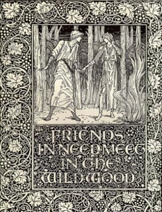
Figure 4: A Burne-Jones Woodcut from The Well at the World’s End
Morris’s fascination with Medievalism was refined during his studies at Oxford University, where he focused on classical studies and theology. This interest was encouraged by his association with the “Birmingham Set,” a circle of Oxford friends who shared passions for visual art, Romantic literature, ecclesiastical music, and historic architecture. Embracing the ideals of the Medievalist movement, they looked to the past as a source of artistic inspiration and social meaning, often contrasting it with the rapidly industrializing world around them. Among the group’s members were Edward Burne-Jones and Charles Faulkner, who later joined Morris in founding Morris, Marshall, Faulkner & Co. in 1861.[v]
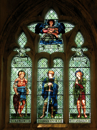
Figure 5: A Morris & Co. stained-glass window designed by Edward Burne-Jones
After his time at Oxford, Morris chose to concentrate on painting and became an apprentice to Dante Gabriel Rossetti, one of the founders of the Pre-Raphaelite Movement, a group that shared his passion for a romanticized version of the Medieval world, which influenced their choice of subject matter, intense colors, and artistic style. Morris and Burne-Jones were both highly influenced by this Pre-Raphaelite style. While Burne-Jones specialized in tapestries, stained-glass windows, ceramic tiles, and jewelry, Morris developed his interest in decorative design and became a prolific author of novels, poetry, and plays. An example of this creative bent was his book, The Well at the World’s End.
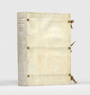
Figure 6: Beautiful Vellum Binding and Silk Ties
The physical book is stunning. The pale vellum binding with delicate silk ties, thick, untrimmed handmade linen paper, and highly decorative design elements immediately transport the reader to another time – which was the goal. It was created to capture the Victorian idealized view of the Middle Ages. The woodcuts are incredible. Although they depict violent scenes, they are so beautifully articulated that the topics are softened by their sheer beauty and elegant design. The end page has the word “Kelmscott,” surrounded by a foliage design. An additional area of interest is a bookplate indicating that the novel was purchased in honor of early college physician Dr. Anna Maria Gove, from a bequest by her cousin, Maria Clark Brace.
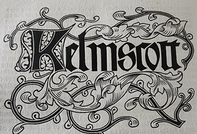
Figure 7: The Kelmscott Press
The book is widely considered a fantasy novel, telling the story of Prince Ralph of Upmeads, who desires to leave his kingdom and see the world. During his journeys, he comes across a beautiful maiden named Ursula, whose youth and beauty lead him to believe that she has drunk from the magical well at the world’s end. After several harrowing episodes, Ralph sets out to find the well. After some rather convoluted adventures and thrilling battles, the prince finds the well and is, in fact, “enlivened” by the water. He finally returns to Upmeads and becomes the King with his love, Ursula, by his side. Although modern readers may find the narrative and writing style a bit ponderous, The Well at the World’s End was highly praised by authors such as H. G. Wells and C. S. Lewis and is now seen as a precursor to the modern fantasy genre.
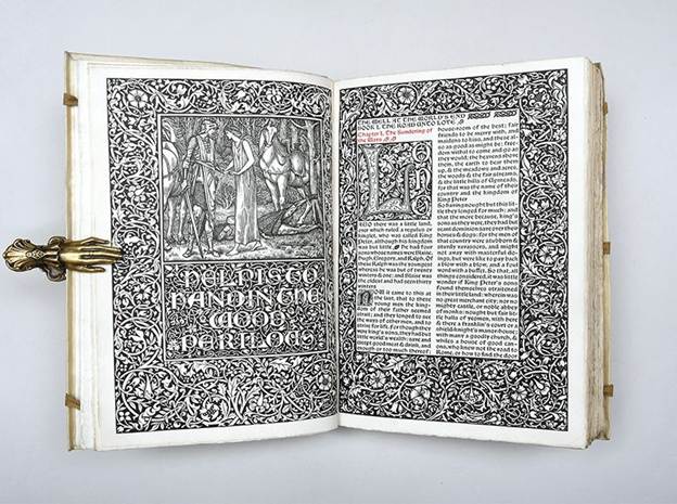
Figure 8: The Noble Steed Silverfox
The Well at the End of the World is one of 14 first edition books printed by Morris’s Kelmscott Press, in our Rare Book Collection, including News from Nowhere, or An Epoch of Rest: Being Some Chapters from a Utopian Romance (1892), Hand and Soul (1895), and The Works of Geoffrey Chaucer, Now Newly Imprinted (1896).
The Well at the End of the World will be on display in the Hodges Reading Room until October.
[i] The Kelmscott Press, founded in 1891 by William Morris and Emery Walker, was named in honor of Kelmscott Manor, Morris’s home in Oxfordshire. Between 1891 and 1898, the press published over 53 limited-edition books reflecting the Gothic Revival style popular at the time.
[ii] Walsdorf, John J., William Morris in Private Press and Limited Editions: A Descriptive Bibliography of Books by and about William Morris 1891-1981, Phoenix: Oryx Press, 1983, p. 76.
[iii] “Morris’s Influential Fantasy Novel,” Peter Harrington, London, 2023.
[iv] Peterson, William S., The Kelmscott Press: A History of William Morris’s Typographical Adventure, Oxford:
Clarendon Press, 1991, p. 158.
[v] Renamed Morris & Co. in 1875, the firm became one of the leading proponents of the Arts and Crafts movement and transformed the design of decorative arts in Britain.
- Peg Woffington by Charles Reade 1899
by Audrey Sage
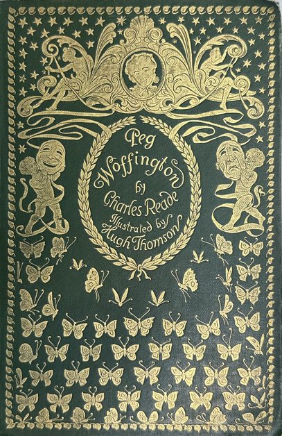
The novel Peg Woffington which was written in 1853 by the British author Charles Reade. Inspired by the popular stage play Masks and Faces, Reade portrayed the London success of the Irish actress Peg Woffington (1720–1760).
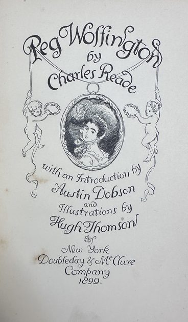
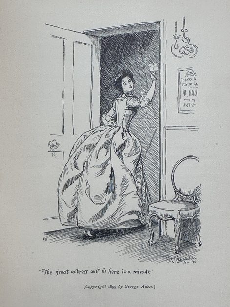
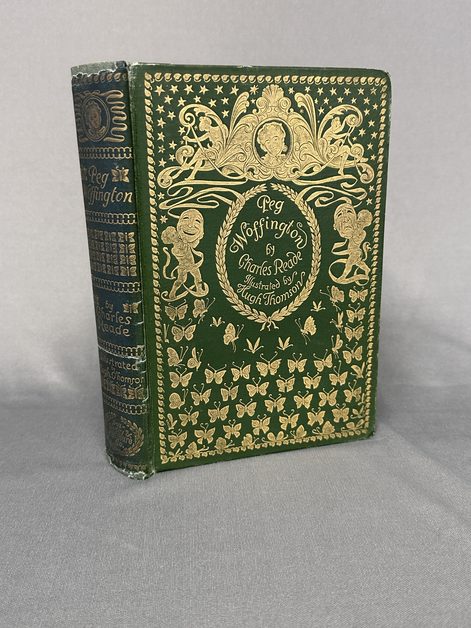
UNCG owns a copy of this work in the Robert C. Hanson Performing Arts collection in Special Collection and University Archives. [https://uncg.as.atlas-sys.com/repositories/2/resources/454]
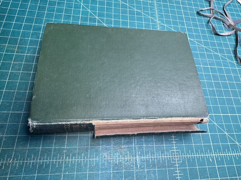
Our copy was in need of some conservation treatment and our conservator, Audrey Sage, was able to provide the restoration it needed.
The spine cloth was worn and falling away from the cover. Its pages were very dirty and in need of surface cleaning, so Audrey carefully cleaned each page throughout.
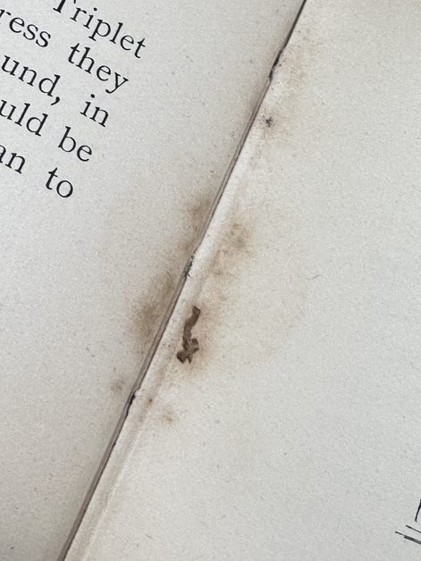
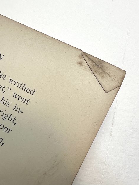
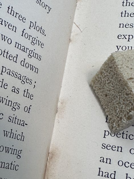
The cover was separated from the textblock and the old brittle adhesive and backing cloth were removed. A new layer of starch paste was applied along with layers of japanese paper, linen, and a moriki paper hollow.
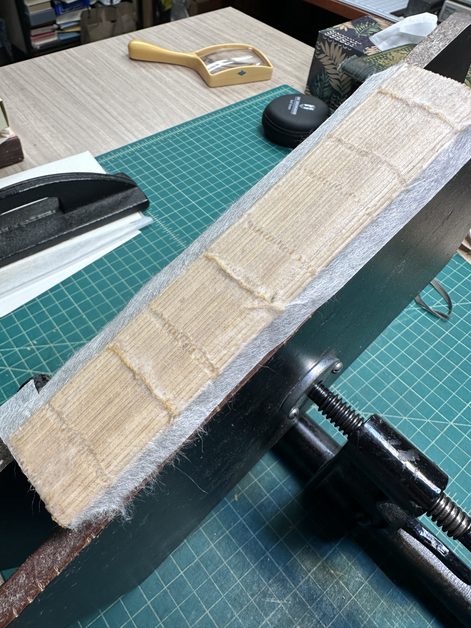
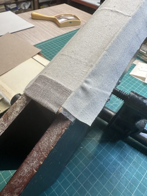
Audrey used care to lift the cloth covering and endpapers from the cover boards.
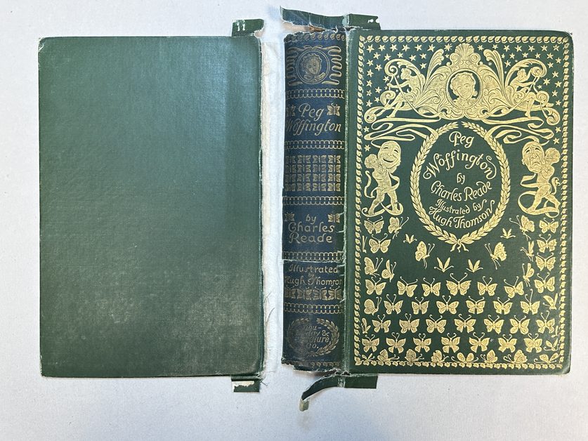
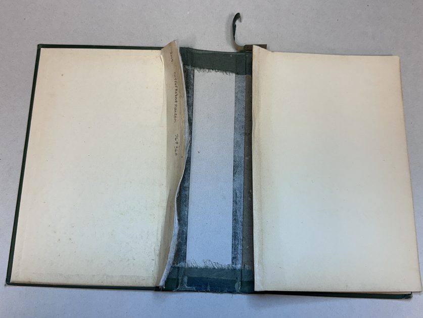
A toned Moriki spine backed with RK27 japanese paper was inserted under the original cloth to repair the torn spine.
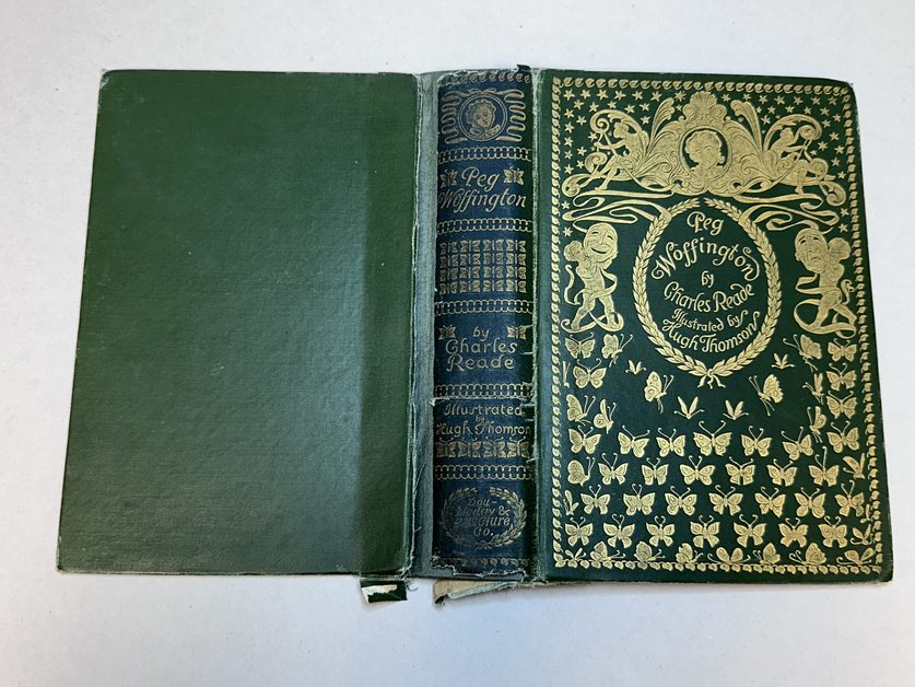
The newly reconstructed textblock could then be inserted into the mended cover and the original endpapers laid down over the linen cloth backing. This restoration will serve this historic volume for many years to come.
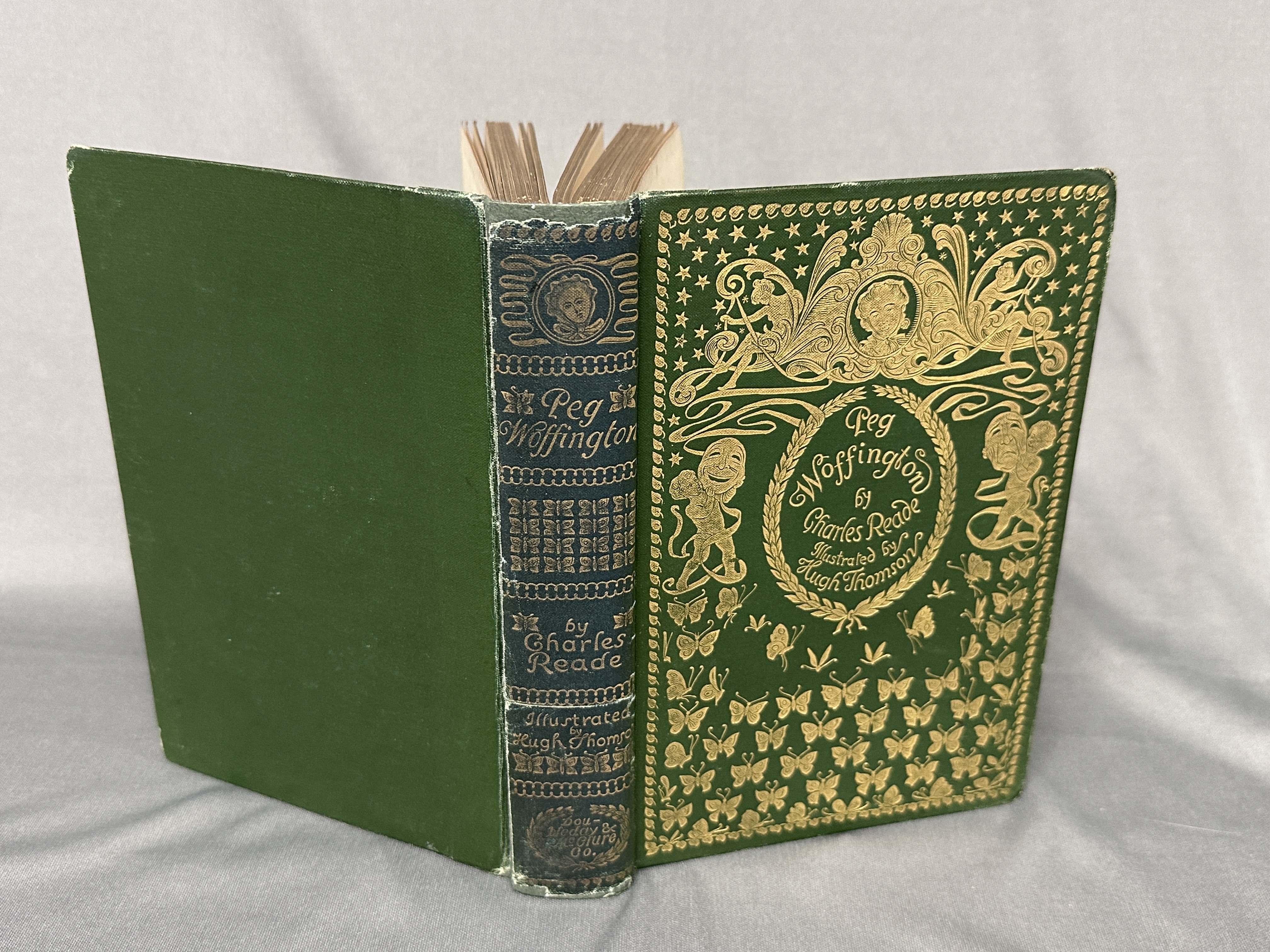
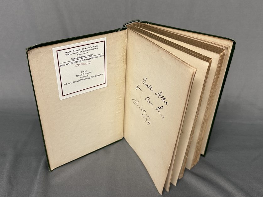
Peg Woffington is now ready for her next performance, waiting in the wings of the Jackson library stacks.
- Sheryl Oring: Writing Home: Conversations with our Ancestors
by Audrey Sage
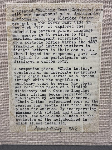
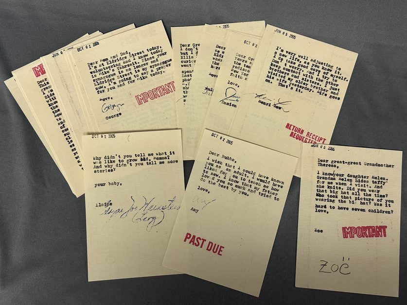
“I created “Writing Home: Conversations with our Ancestors” as an interactive performance at the Eldridge Street Project on the Lower East Side in New York City. It explored the connection between place, language and memory as it relates to the American immigrant experience. I set up a portable office within the 1887 synagogue and invited visitors to dictate letters to their ancestors. Then I typed the responses, gave the original to the participants and displayed a carbon copy.
A companion piece, “Chain Letter,” consisted of an intricate sculptural paper chain that served as a screen through which the magnificent sanctuary could be seen. The chain was made from pages of a Yiddish dictionary and a Chinese-language volume listing books permitted for publication by Communist censors. “Chain Letter” referenced some of the reasons that people left their birthplaces for America. By incorporating both Yiddish and Chinese texts, the work also alluded to the evolution of the neighborhood in which it was installed.” Sheryl Oring 5/18
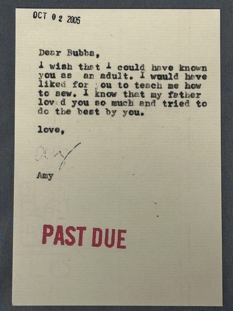
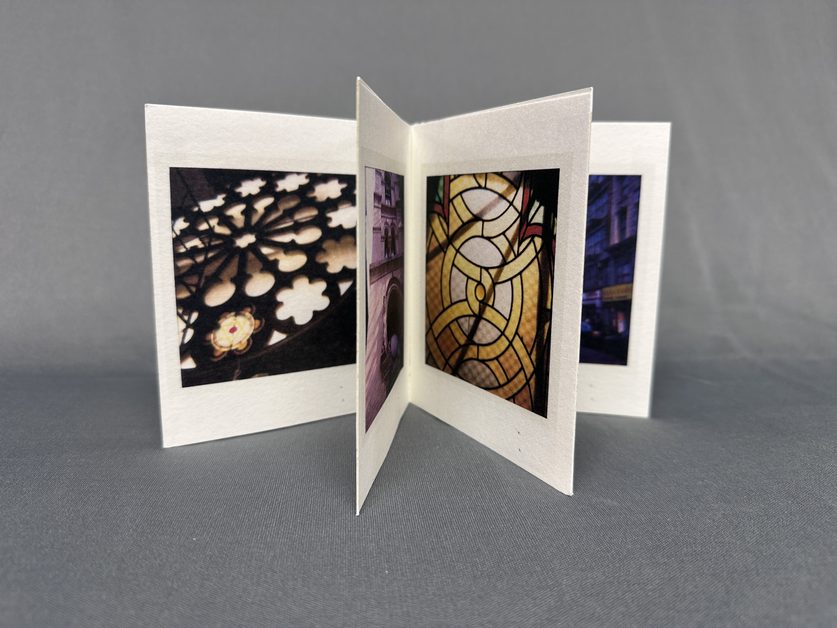
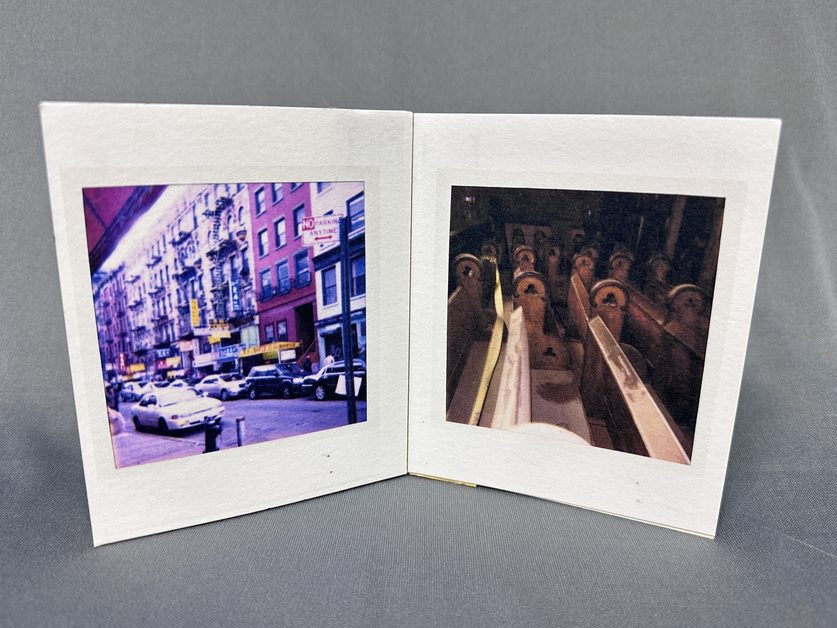
Oring is continuing to perform “Writing Home” at venues such as the International Center in New York City. And together with Jamie Munkatchy of the Booklyn Artists Alliance, Oring has created a limited edition artist book based on this project.
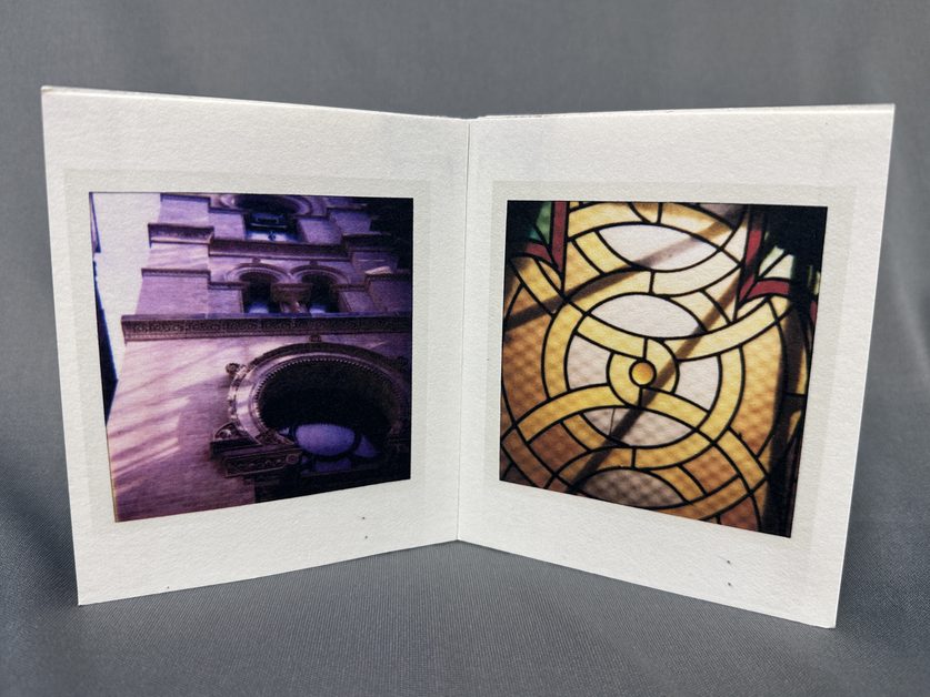
https://www.sheryloring.org/writing-home
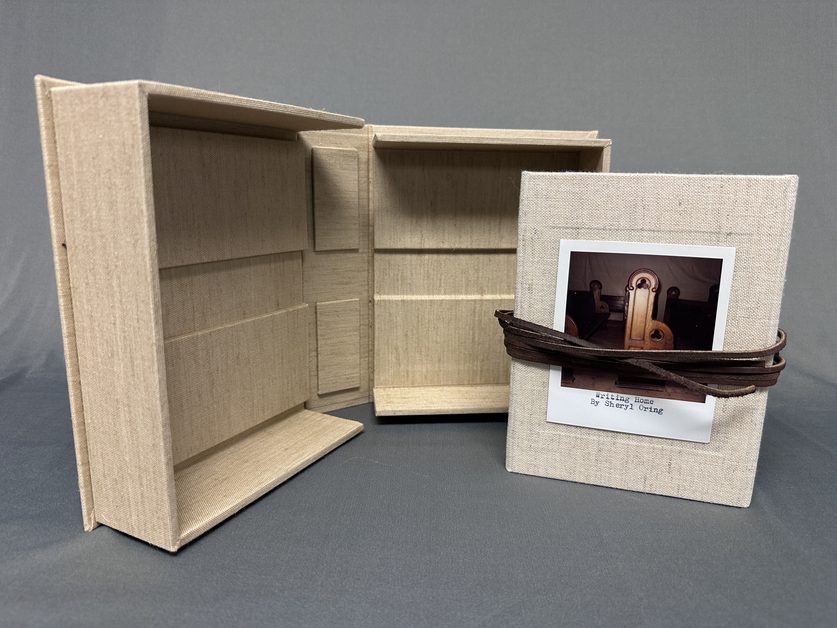
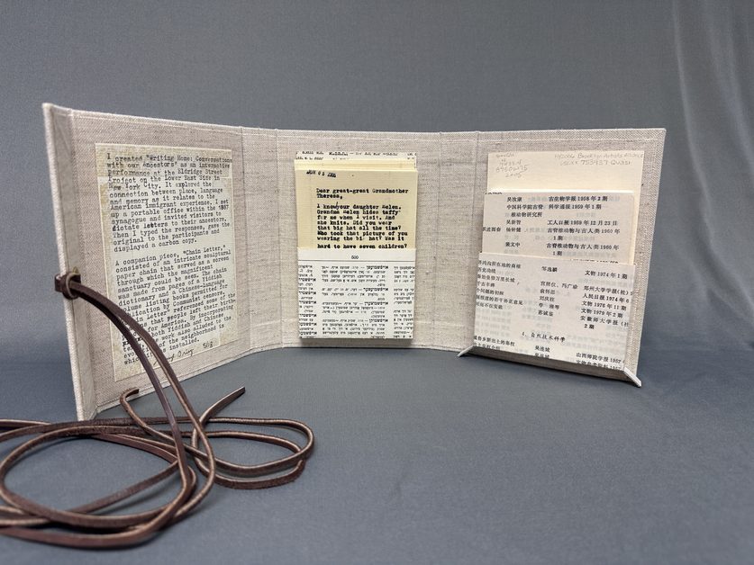
This work of art, created by Sheryl Oring in 2006, is a 7.25 x 5.5″ three-panel portfolio. It closes with leather ties and is bound in beige linen bookcloth by Jamie Munkatchy. Each book features an original Polaroid photograph of the Eldridge Street Synagogue or the surrounding neighborhood on the cover. Contents include a hand-typed introduction; 43 letters dictated during performances at the Eldridge Street Project in 2005; and, a flag-bound book featuring eleven Polaroid photos of Eldridge Street Synagogue and the surrounding neighborhood. Inside pockets are made out of pages from a Yiddish dictionary and a Chinese-language volume listing books permitted for publication by Communist censors, alluding to the mixed nature of this Lower East Side-Chinatown neighborhood. The volume is housed in a custom built clamshell box with matching linen bookcloth.

photo: sheryloring.org “Sheryl Oring examines critical social issues through projects that incorporate old and new media to tell stories, examine public opinion and foster open exchange. Using tools typically employed by journalists (the camera, the typewriter, the pen, the interview and the archive) she builds on experience in her former profession to create installations, performances, prints, artist books, sculptures, and internet-based works that address themes of democracy, citizenship, free expression, first amendment rights, story-telling and activism through art.
Oring is a Creative Capital Fellow and has received grants from Franklin Furnace, New York Foundation for the Arts, the Puffin Foundation, and the North Carolina Council for the Arts. She has shown her work at the U.S. Pavilion of the Venice Architecture Biennale; Bryant Park in Manhattan; the Brooklyn Public Library; the Free Library of Philadelphia, the National Liberty Museum in Philadelphia; the Jewish Museum Berlin; and the Museum of Contemporary Art in Chicago. She has also presented work at Art in Odd Places in New York; the Art Prospect festival in St. Petersburg, Russia; Encuentro in Sao Paolo, Brazil; and the International Symposium on Electronic Art in Dubai.
She has completed public art commissions at the San Diego International Airport and at the Tampa International Airport. Collecting institutions include the Library of Congress; Museum of Modern Art; Tate Britain; Bibliothèque nationale de Luxembourg; University of North Carolina at Chapel Hill; La Jolla Athenaeum; Yale University; University of California, Irvine; and many other university libraries across the United States.
Alongside her art practice, Oring is an academic leader. She currently serves as Professor and Chair of the Department of Applied Design at Appalachian State University in Boone, NC. Prior to joining App State, she worked as Professor and Dean of the School of Art at University of the Arts in Philadelphia; Professor and Chair of the James Pearson Duffy Department of Art, Art History, and Design at Wayne State University in Detroit; and as Assistant and Associate Professor in the School of Art at University of North Carolina at Greensboro.” -sheryloring.org/about
- Cooking Through the Counties: Brown Sugar Pecan Pie from Rutherford County
When I examined the cookbook, The Whole Town’s Cooking, compiled by the Rutherfordton Woman’s Club, I was intrigued to find a full page of recipes for pecan pie. I’ll be the first to tell you that pecan pie isn’t one of my favorites. I often find it too sweet – it makes my teeth sing – and the texture reminds me of peanut brittle. So, when I saw this recipe for Brown Sugar Pecan Pie, attributed to Mrs. Beaty Bass, I knew I had to try it because it was the one recipe that did NOT call for corn or Karo syrup.
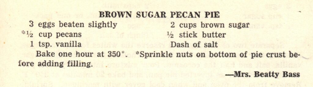
Another winning point for Mrs. Bass was the simplicity of her ingredients and instruction – often an indicator of a practiced cook!
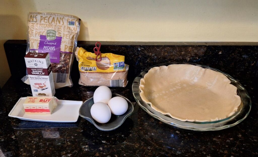
All of the ingredients – and yes, you do see a store bought pie crust! While stirring the filling, I knew this pie would be different. The filling has the consistency of warm caramel, and after fully combined, has a thick pour. This showed great promise for a different pecan pie experience from the corn/Karo syrup recipes I’ve made in the past.
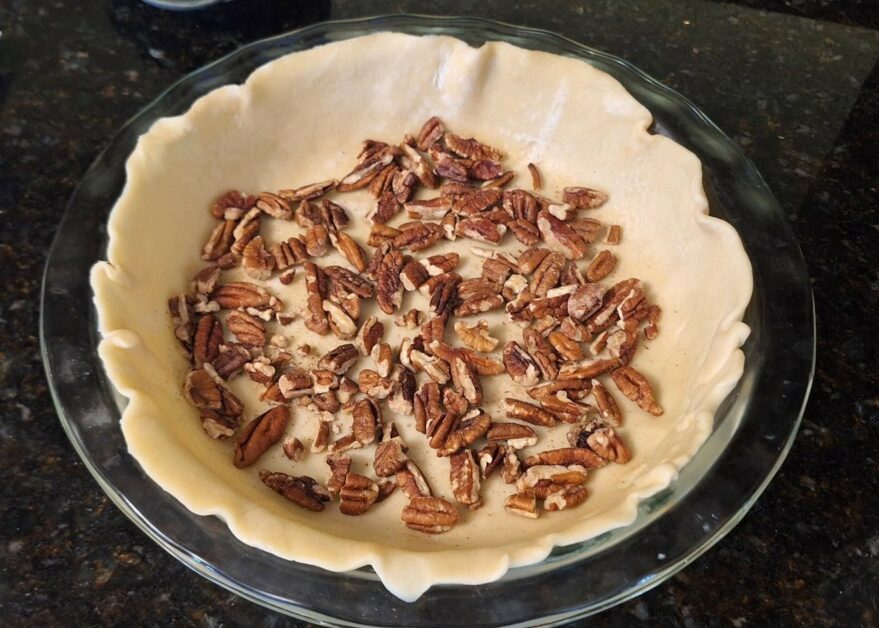
Pecans, sprinkled. 
The filling. Even before the pie went into the preheated oven, it smelled so good – and not too sweet.
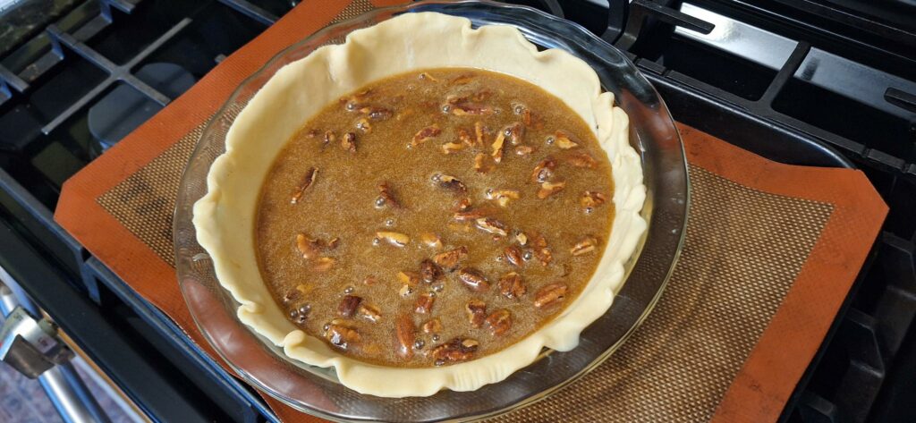
Ready for the oven! An hour passed between these two photos and during that time, as the warm smell of caramel and pecans wafted from my oven, I thought that I may need to know more about Mrs. Beaty Bass, of the Brown Sugar Pecan Pie fame. I reached out to the folks in the Forgotten Rutherford County, NC Facebook group for any memories of Mrs. Beaty Bass. While no one really remembered her, they did help me by identifying her husband as one of the local doctors, Dr. Beaty Bass. That was all the information I needed in order to discover more about Mrs. Bass.
Mattie Young “Patsy” Smith was from Winston-Salem, NC, and attended the Flora Macdonald College in Red Springs, NC. After graduating, she worked in Winston, as the City Hospital librarian. Oh joy! Our recipe comes from a librarian! This is where she met Dr. Beaty Bass during his residency. The couple married in 1942. Our copy of this cookbook dates to 1946; by this time she would have one child, and go on to have three more.
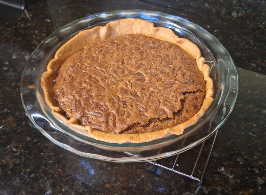
Fresh from the oven! What a lucky family they were to have this pie! Hands down, this is the best pecan pie I’ve ever tasted. Is it sweet? Yes, those two cups of brown sugar don’t hide. Yet the sweetness doesn’t overpower the softened pecans. As good as this pie is, it is only improved by a dollop of ice cream. The filling is soft, almost a cookie-like texture, and just melts in your mouth.
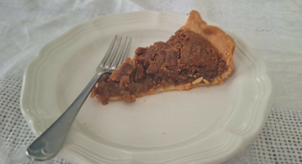
The best pecan pie, period. The only thing wrong with this pie is that I only made one. Next time – and there will be a next time – I’ll make at least two!
-Carolyn Shankle
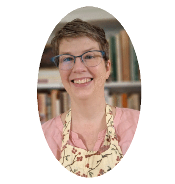
- Student Success: Sammi Webb
I started working in SCUA under the Women Veterans Historical Project in September 2025 as a research graduate assistant. I had just started my master’s program in Library and Information Science, and I was really looking forward to working in the archives and gaining new experiences. Throughout the year, I processed two collections, participated in two exhibits, and created a libguide for WVHP!
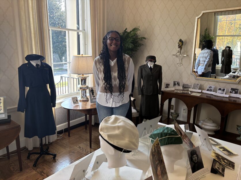
In the beginning, I was very excited yet nervous since I was in a new working environment and learning new skills. The first exhibit was for the annual WVHP luncheon, and we focused on WWII. Luckily, I had a partner where we divided the branches between us, and my part consisted of the Army (including the 6888th Central Postal Directory Battalion) and the American Red Cross. While completing the exhibits, I gained a newfound appreciation for women veterans and learned a lot about what goes into curating an exhibit!
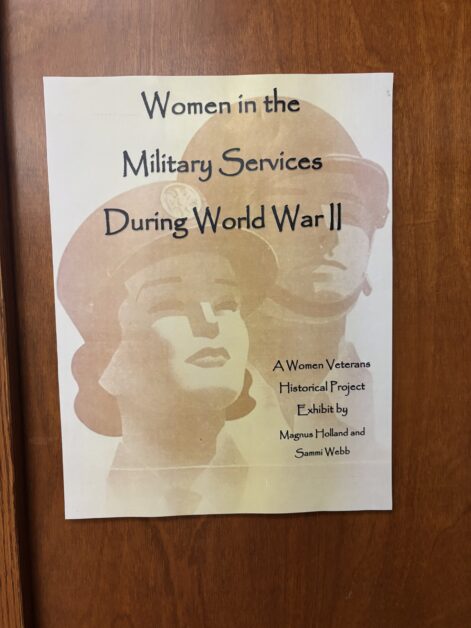
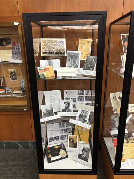
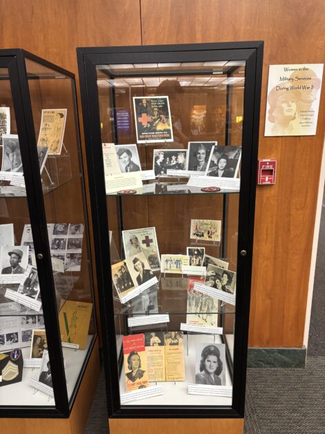
Also, creating the libguide and processing two collections developed my research and writing skills! I really enjoy doing research, so creating the libguide was a blast. It was also a lot of fun to find the resources for books and websites while also highlighting the women in the collections. Moreover, I think my favorite part of the year was processing collections. I was able to see the person outside of the materials while also keeping in mind what a researcher would look for.
Overall, this past year working in SCUA has been amazing and I am excited to return for my second year. I will definitely use these skills in my future career!
SCUA News
Special Collections and University Archives
Welcome to the SCUA News Blog


Previous Posts
- September 2026
- June 2026
- March 2026
- December 2025
- August 2025
- May 2025
- February 2025
- October 2024
- August 2024
- June 2024
- February 2024
- January 2024
- December 2023
- August 2023
- May 2023
- February 2023
- January 2023
- November 2022
- August 2022
- May 2022
- February 2022
- December 2021
- November 2021
- October 2021
- July 2021
- March 2021
- February 2021
- December 2020
- November 2020
- September 2020
- May 2020
- December 2019
- October 2019
- September 2019
- August 2019
- July 2019
- May 2019
- April 2019
- March 2019
- February 2019
- January 2019
- November 2018
- June 2018
- May 2018
- April 2018
- March 2018
- December 2017
- October 2017
- August 2017
- July 2017
- June 2017
- April 2017
- February 2017
- January 2017
- December 2016
- November 2016
- October 2016
- September 2016
- August 2016
- July 2016
- April 2016
- March 2016
- February 2016
- January 2016
- November 2015
- October 2015
- September 2015
- August 2015
- June 2015
- May 2015
- April 2015
- March 2015
- February 2015
- January 2015
- December 2014
- October 2014
- September 2014
- July 2014
- June 2014
- April 2014
- March 2014
- February 2014
- January 2014
- December 2013
- November 2013
- October 2013
- August 2013
- June 2013
- May 2013
- April 2013
- February 2013
- November 2012
- October 2012
- September 2012
- August 2012
- July 2012
- June 2012
- May 2012
- April 2012
- March 2012
- February 2012
- January 2012
- November 2011
- October 2011
- June 2011
- May 2011
- April 2011
- March 2011
- February 2011
- January 2011
- December 2010
- November 2010
- October 2010
- September 2010
- July 2010
- June 2010
- May 2010
- April 2010
- March 2010
- February 2010
- January 2010
- December 2009
- November 2009
- October 2009
- September 2009
- August 2009
- July 2009
- June 2009
- April 2009
- February 2009
- November 2008