by Kathelene McCarty Smith
From time to time, a book stops you in your tracks. The Well at the World’s End did exactly that. The department acquired the book in 2023, but I had not had the opportunity to take a close look at it since then. Of course, the instant I opened its vellum binding, I once again found myself falling down a rabbit hole, which, of course, necessitated learning more about our edition.
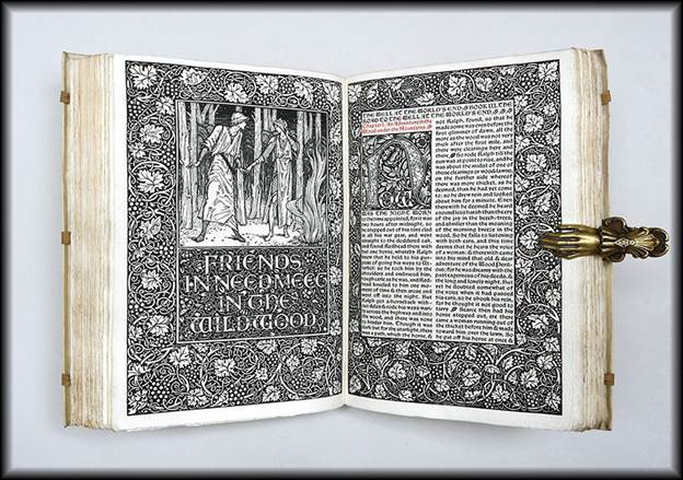
Figure 1: UNCG’s Beautiful Kelmscott Press First Edition of The Well at the World’s End
The Well at the World’s End is a remarkable treasure. Published in 1896, the novel was written by William Morris and printed by the Kelmscott Press. While Morris is frequently remembered first for his impact on interior design, he was a complex and influential presence across the Victorian cultural landscape. Indeed, his interests spanned art, literature, architectural preservation, and social reform.
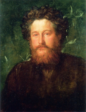

Figure 2: Portrait of William Morris by George Frederic Watts and portrait of Edward Burne-Jones by George Frederick


The book was printed by Morris at the Kelmscott Press in Hammersmith, Middlesex, England, as part of a limited edition of 350 copies on paper. A collaborative effort between Morris and his lifelong friend Edward Burne-Jones, its design harkens back to Medieval book production techniques, mirroring the interest in Medievalism and the Pre-Raphaelite movement of the late 19th century, which the Kelmscott Press embraced. [i]
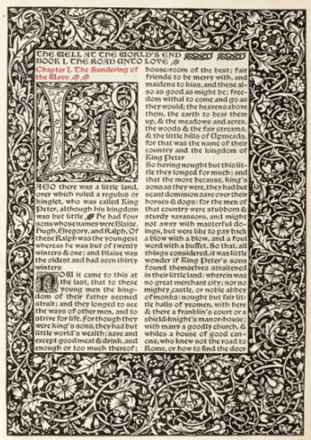
Figure 3: Gothic Lettering and Double Columns Seen in the Novel
Its vellum binding, elaborate lettering, double columns, and wood-engraved images reflect the popularity of the Neo-Gothic style in the Victorian period, and it was the first Kelmscott Press book produced in this format.[ii] While the author chose the Chaucer typeface and designed the capital initials and decorative border ornamentation, Burne-Jones created designs for four distinct woodcuts, which were engraved by W. H. Hooper. Initially, the illustrations were assigned to Charles Fairfax Murrey, then to Arthur Joseph Gaskin, who also designed for the Kelmscott Press. Although Murrey created nineteen illustrations for the project, Morris ultimately found that Burne-Jones’ artwork aligned more closely with the book’s general style, and he chose his friend’s designs.[iii] This vacillation over the choice of illustrations delayed the printing process, making The Well at the World’s End the Kelmscott book that took the longest to produce.[iv]
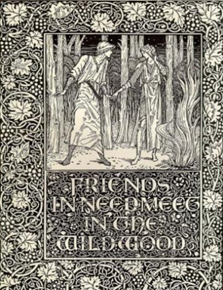
Figure 4: A Burne-Jones Woodcut from The Well at the World’s End
Morris’s fascination with Medievalism was refined during his studies at Oxford University, where he focused on classical studies and theology. This interest was encouraged by his association with the “Birmingham Set,” a circle of Oxford friends who shared passions for visual art, Romantic literature, ecclesiastical music, and historic architecture. Embracing the ideals of the Medievalist movement, they looked to the past as a source of artistic inspiration and social meaning, often contrasting it with the rapidly industrializing world around them. Among the group’s members were Edward Burne-Jones and Charles Faulkner, who later joined Morris in founding Morris, Marshall, Faulkner & Co. in 1861.[v]
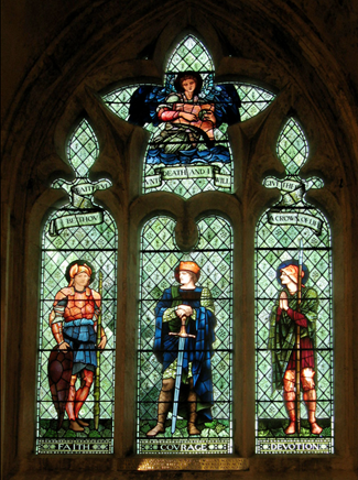
Figure 5: A Morris & Co. stained-glass window designed by Edward Burne-Jones

After his time at Oxford, Morris chose to concentrate on painting and became an apprentice to Dante Gabriel Rossetti, one of the founders of the Pre-Raphaelite Movement, a group that shared his passion for a romanticized version of the Medieval world, which influenced their choice of subject matter, intense colors, and artistic style. Morris and Burne-Jones were both highly influenced by this Pre-Raphaelite style. While Burne-Jones specialized in tapestries, stained-glass windows, ceramic tiles, and jewelry, Morris developed his interest in decorative design and became a prolific author of novels, poetry, and plays. An example of this creative bent was his book, The Well at the World’s End.
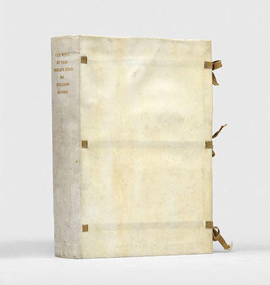
Figure 6: Beautiful Vellum Binding and Silk Ties
The physical book is stunning. The pale vellum binding with delicate silk ties, thick, untrimmed handmade linen paper, and highly decorative design elements immediately transport the reader to another time – which was the goal. It was created to capture the Victorian idealized view of the Middle Ages. The woodcuts are incredible. Although they depict violent scenes, they are so beautifully articulated that the topics are softened by their sheer beauty and elegant design. The end page has the word “Kelmscott,” surrounded by a foliage design. An additional area of interest is a bookplate indicating that the novel was purchased in honor of early college physician Dr. Anna Maria Gove, from a bequest by her cousin, Maria Clark Brace.
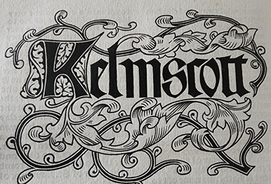
Figure 7: The Kelmscott Press
The book is widely considered a fantasy novel, telling the story of Prince Ralph of Upmeads, who desires to leave his kingdom and see the world. During his journeys, he comes across a beautiful maiden named Ursula, whose youth and beauty lead him to believe that she has drunk from the magical well at the world’s end. After several harrowing episodes, Ralph sets out to find the well. After some rather convoluted adventures and thrilling battles, the prince finds the well and is, in fact, “enlivened” by the water. He finally returns to Upmeads and becomes the King with his love, Ursula, by his side. Although modern readers may find the narrative and writing style a bit ponderous, The Well at the World’s End was highly praised by authors such as H. G. Wells and C. S. Lewis and is now seen as a precursor to the modern fantasy genre.
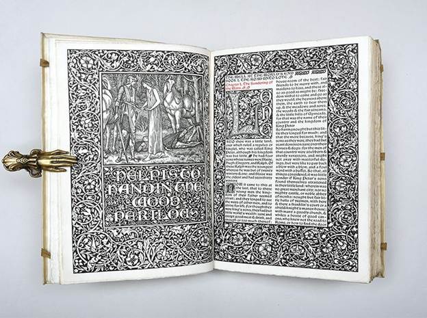
Figure 8: The Noble Steed Silverfox
The Well at the End of the World is one of 14 first edition books printed by Morris’s Kelmscott Press, in our Rare Book Collection, including News from Nowhere, or An Epoch of Rest: Being Some Chapters from a Utopian Romance (1892), Hand and Soul (1895), and The Works of Geoffrey Chaucer, Now Newly Imprinted (1896).
The Well at the End of the World will be on display in the Hodges Reading Room until October.
[i] The Kelmscott Press, founded in 1891 by William Morris and Emery Walker, was named in honor of Kelmscott Manor, Morris’s home in Oxfordshire. Between 1891 and 1898, the press published over 53 limited-edition books reflecting the Gothic Revival style popular at the time.
[ii] Walsdorf, John J., William Morris in Private Press and Limited Editions: A Descriptive Bibliography of Books by and about William Morris 1891-1981, Phoenix: Oryx Press, 1983, p. 76.
[iii] “Morris’s Influential Fantasy Novel,” Peter Harrington, London, 2023.
[iv] Peterson, William S., The Kelmscott Press: A History of William Morris’s Typographical Adventure, Oxford:
Clarendon Press, 1991, p. 158.
[v] Renamed Morris & Co. in 1875, the firm became one of the leading proponents of the Arts and Crafts movement and transformed the design of decorative arts in Britain.
Catherine T. Magid says:
Astonishingly beautiful- what a gift to the collection.
Catherine T. Magid
Anne Wallace says:
I did not realize that SCUA had acquired a Kelmscott book–gorgeous!! A superb addition, encompassing such various research interests.