by Audrey Sage
I find summertime to be one of the most exciting times of the year because it affords the opportunity to witness the abundance and proliferation of insects and plant life in the garden. This wonderful artist book “ABC of Bugs and Plants in a Northern Garden” is filled with fantastic information and beautiful imagery presented in the always fun format of an abecedarian.
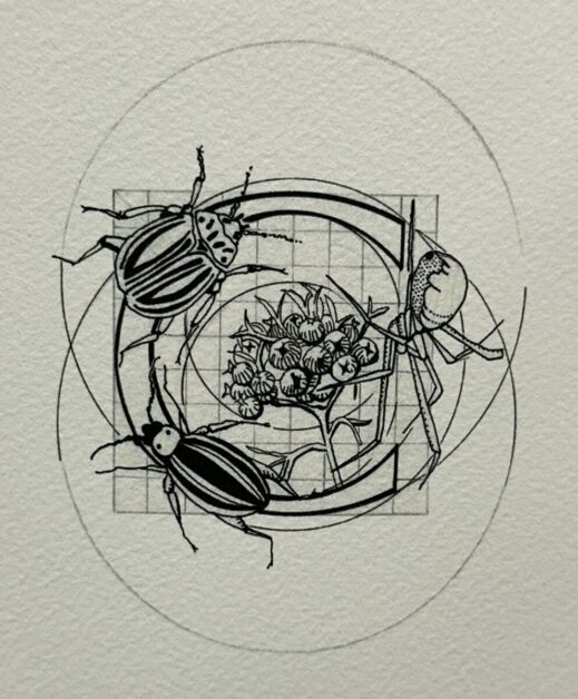
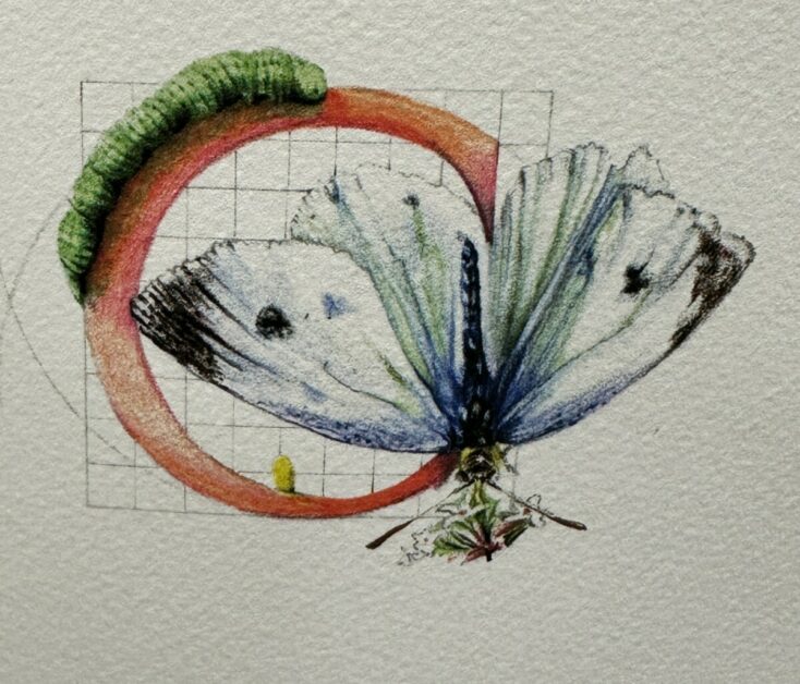
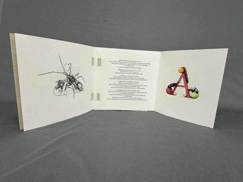
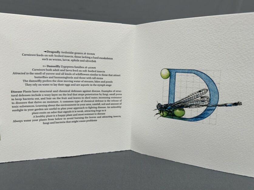
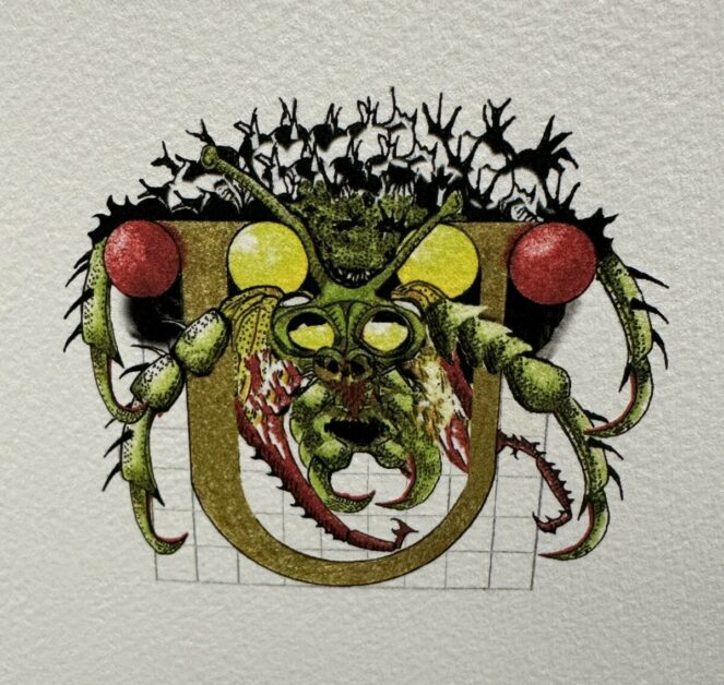
“A collaboration between Vermonters Claire Van Vliet, proprietor of Janus Press, and Judy Fairclough Sgantas, an artist and gardener. This work is a double alphabet book, with classical Roman letter forms entwined with plant life and insects. For each letter of the alphabet a black-and-white image faces a second colored image, revealed by opening an opposing folded leaf, with text positioned on a center panel between the complementary images. The content is about garden insects–what attracts or repels them–and a plant’s defenses. The text gives definitions of the insects for that letter including both common and Latin names. Information ranges from ‘common habitat’ to ‘natural control.'” – Vamp & Tramp Booksellers
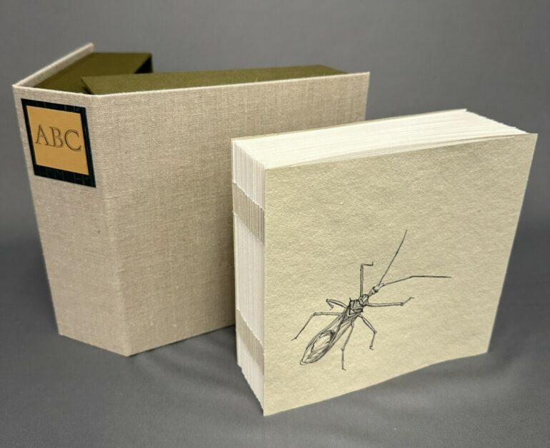
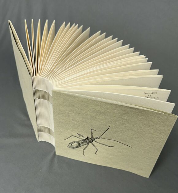
As described in this wonderful volume, the variety, collaboration and attention to detail and quality of materials is astounding. It is always fascinating to handle a bound book that is structured in a non-adhesive-binding technique such as this which uses handmade paper, cut into strips, and laced through the text pages.
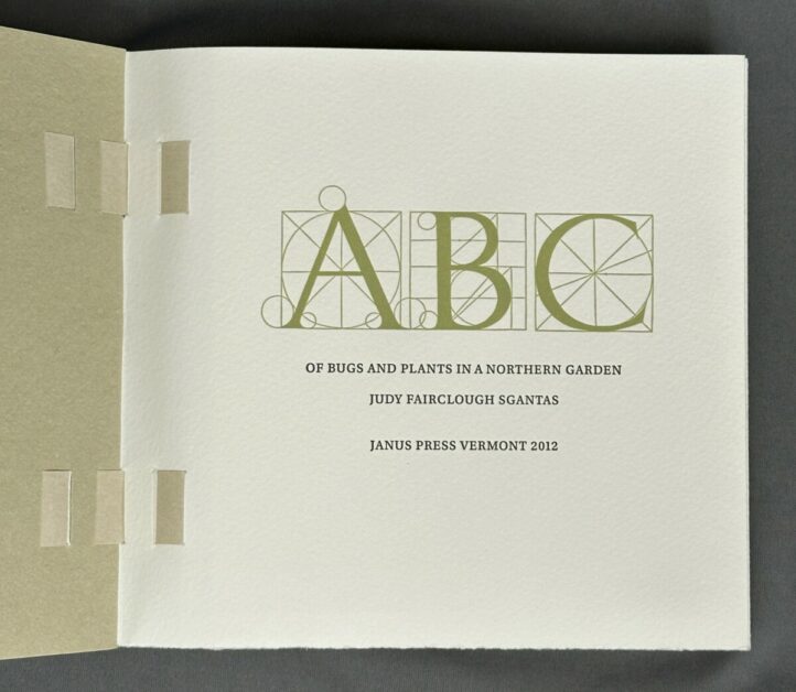
“The title page ABC is from Pacioli’s drawings of the alphabet in the appendix of De Divina Proportione. The classical titling Augustea Open, used on the box label, is from the Niebolo Foundry in Turin and was designed in 1951 by Aldo Novarese with Alessandro Butti.”
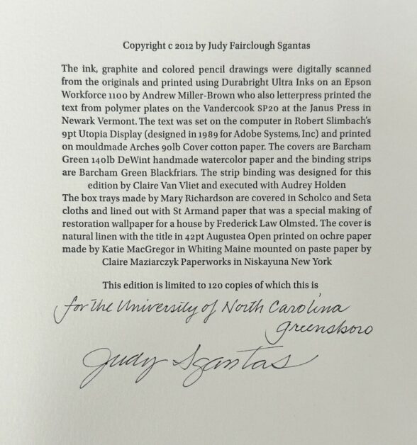
“The ink, graphite, and colored pencil drawings were digitally scanned from the originals and printed using Durabright Ultra Inks on an Epson Workforce 1100 by Andrew Miller-Brown who also letterpress printed the text from polymer plates on the Vandercook SP20 at the Janus Press in Newark, Vermont. The text was set on the computer in Robert Slimbach’s 9pt Utopia Display (designed in 1989 for Adobe Systems, Inc.) and printed on mouldmade Arches gold Cover cotton paper. The covers are Barcham Green 140lb DeWint handmade watercolor paper and the binding strips are Barcham Green Blackfriars.”
“The strip binding was designed for this edition by Claire Van Vliet and executed with Audrey Holden. The box trays made by Mary Richardson are covered in Scholco and Seta cloths and lined out with St. Armand paper that was a special making of restoration wallpaper for a house by Frederick Law Olmsted. The cover is natural linen with the title in 42pt Augustea Open printed on ochre paper made by Katie MacGregor in Whiting, Maine, mounted on paste paper by Claire Maziarczyk Paperworks in Niskayuna, New York.”

“To many people all bugs are ugly but with a closer look and study, one finds a symphonic play between the various bugs and between the bugs and plants, even the most troublesome Bug is derived from Middle English bugge and originally meant goblin or bogy, retained today in bugbear. Over time, and by uncertain means, it developed its modern usage referring to an insect, especially beetle-like creepy-crawlies, and sometimes specifically to the bedbug. Insect, on the other hand, comes from a Latin verb meaning ‘to cut in’ and refers to the nearly divided structure of the bodies of insects. Today bug can mean almost any insect, even those with wings like black flies and mosquitoes, and is widely used in daily working language. From bugbears to potato bugs and bedbugs to stomach bugs and ‘Don’t bug me!’ bugs are everywhere we don’t want them to be.”
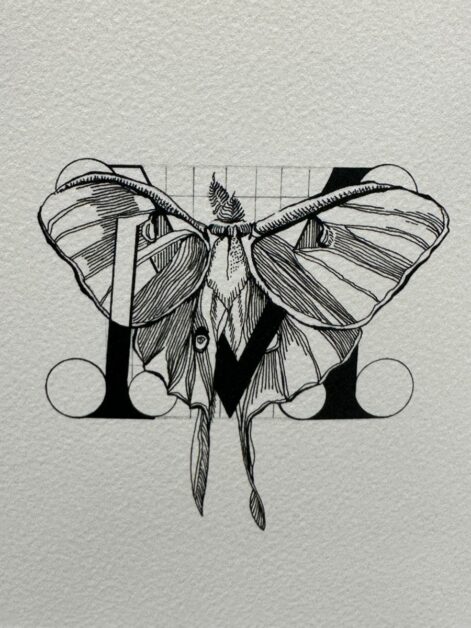
“Note on the Letters: The geometrical formation of Roman capitals was inspired by Renaissance interest in the monumental inscriptions of classical antiquity by such pioneering transcribers and collectors as Cyriacus of Ancona. The earliest example of a work to show diagrams of letters formed by geometrical means is a 1463 manuscript by Felice Feliciano of Verona. In 1509 the first printed edition of Pacioli’s De Divina Proportione appeared in Venice, including an appendix on geometrical letterforms with the different circle sizes that determine the curves of the letters and serifs. Later examples using the circles include works published by: Si-gismondo Fanti, Venezia 1514; Francesco Torniello, Milano 1517; Albrecht Durer, Nuremberg 1525; Giambattista Verini, Toscolano 1526 and Geoffrey Tory, Paris 1529. Different designers divided the basic square into grids of nine, ten and twelve divisions to help determine the shape and proportion of the letters.”